Using colour in marketing is about far more than aesthetics. We subconsciously associate certain things with certain colours, and that is why colour psychology matters in marketing and above all in corporate branding.
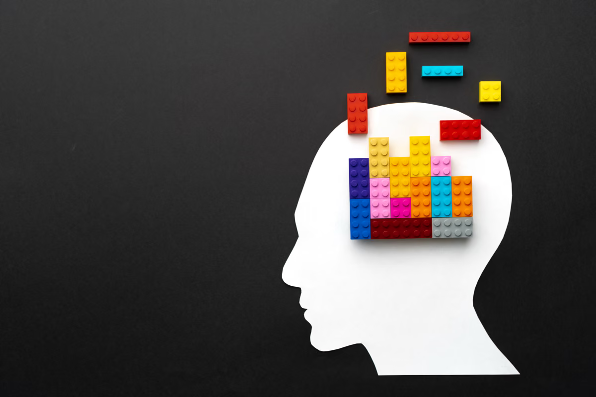
Colours affect us in different ways. Orange is stimulating, for instance, while blue – supposedly the world’s favourite colour – has a calming effect. Combined with one another, colours work differently again than they do on their own. This article sets out what part colour psychology plays in marketing and what to bear in mind when you choose a colour.
How does colour psychology in marketing connect to emotions?
Studies have shown that individual colours speak to particular emotional systems in the brain, which means they trigger different feelings. Ideally, the colours a company picks for its logo, its website or an advertising campaign reach its audience in the best possible way.
Colours should evoke positive emotions, so that the company stays in mind and the audience is prompted to interact or even to buy.
What the individual colours mean
Red
Red stands for love, passion, appetite and emotion. The colour:
- whets the appetite
- encourages impulse purchases
- raises the pulse
- works as a signal colour
Red is a favourite of food delivery services. It also stands for discounts and is often used to draw attention to price cuts. The individual shades work differently again: pink is playful, wine red is elegant, and a bright red is the classic signal colour. For colour psychology in marketing, the point to remember is that red needs a carefully judged intensity.
Blue
Blue stands for the sky and for water, for calm and for peace. The colour:
- raises productivity
- suppresses the appetite
- is popular with men
- conveys trust and security
Blue is the colour of the technology companies Meta, Siemens and HP, and of the Amazon Prime brand. It signals seriousness and makes companies look trustworthy and professional. Banks and insurers are fond of it too, and it is widely used in cosmetics and medicine, because the associations with the colour are almost entirely positive. Here as well the shades differ: turquoise reads as creative and forward-looking, light blue as calming, a bright blue as energetic.
For colour psychology in marketing, the point to remember is that alongside all the positive associations, blue can also stand for coldness and sadness.
Green
Green stands for nature, growth, health and money. It:
- has a relaxing effect
- is associated with wealth
- stands for fertility
- symbolises a closeness to nature
Green triggers plenty of positive associations. In colour psychology, it symbolises the natural and the healthy. Companies that use green are read as sustainable by their audience. As environmental awareness grows, the colour keeps gaining ground in marketing – the obvious example being green as a common choice for organic brands. A dark green reads as serious, a light green as lively, fresh and young – see Starbucks or WhatsApp.
Yellow
Yellow stands for cheerfulness, warmth, communication and stimulation. The colour:
- stands out
- symbolises youth and optimism
- conveys clarity
- reads as dynamic and lively
Yellow is the colour of a well-known fast food chain and of many postal companies around the world. As the brightest of the primary colours it radiates warmth and energy, and it enjoys a positive reception in colour psychology. Gold is a variation of yellow, so the colour also stands for wealth.
Like red, yellow has a signalling effect. It catches the eye and is picked up from a distance, which is why it too should be used with care. Its negative association is danger.
Orange
Orange stands for warmth and enthusiasm, vitality and humour, but also for agitation and warning. The colour:
- encourages buying
- can provoke aggression
- symbolises self-assurance
- invites impulse purchases
Orange is often used in anything aimed at children, and it turns up in beauty products as well. It reads as vital, friendly and witty. That association with vitality makes it a good fit for companies in healthcare – it is the colour of Siemens Healthineers, for example, paired with the Siemens blue. It is a sound compromise between the aggressive red and the less warm yellow, and it counts as a signal colour too.
Violet
Violet, or purple in everyday speech, stands for wisdom, success, wealth and royalty. The colour:
- has a calming effect
- symbolises imagination and creativity
- reads as singular, because it is rare in nature
Purple stands for luxury, which is why it turns up so often on beauty and wellness products. The luxury trade and the confectionery industry like working with violet tones as well. Companies use the colour to underline their creativity and appetite for innovation. Purple comes in a range of shades, among them the Telekom magenta. In colour psychology it stands for creativity, prosperity and luxury, but also for mystery, nobility and magic. Its negative association is intrigue.
How do you find the right colour in marketing?
Colour deserves careful thought, whether the question is a corporate identity, a social media presence or the next advertising campaign. One way in is to collect the points that matter in your corporate communication, along with the features of the product; that list then serves as the frame for the decision. From there you can work out, in the terms of colour psychology, which colours suit the values of the company or the product in question.
The audience belongs in the decision as well. Which colour matches its age, or the emotions the brand wants to trigger? For a company operating internationally, the cultural context also carries real weight – in some countries, for example, white is the colour of mourning.
Which colour is better avoided in marketing?
Brown calls for caution in marketing, even though in itself it stands for groundedness, security and reliability. In theory you could use it to express environmental awareness or a natural quality, since it is a quieter alternative to green. The trouble is that brown is quickly associated with dirt. It is still used here and there – by logistics companies, in outdoor clothing or, unsurprisingly, in coffee advertising.
Conclusion
Colour carries a great deal of weight in marketing and design. The right colours reinforce the effect you want to have on your audience. A deliberate choice of colour speaks to that audience subconsciously and shapes how it responds. Handle colour well and it can lift the customer experience and add to the success of the business.